
Drawing Was the Easy Part or Middle-Out, and Why It Failed
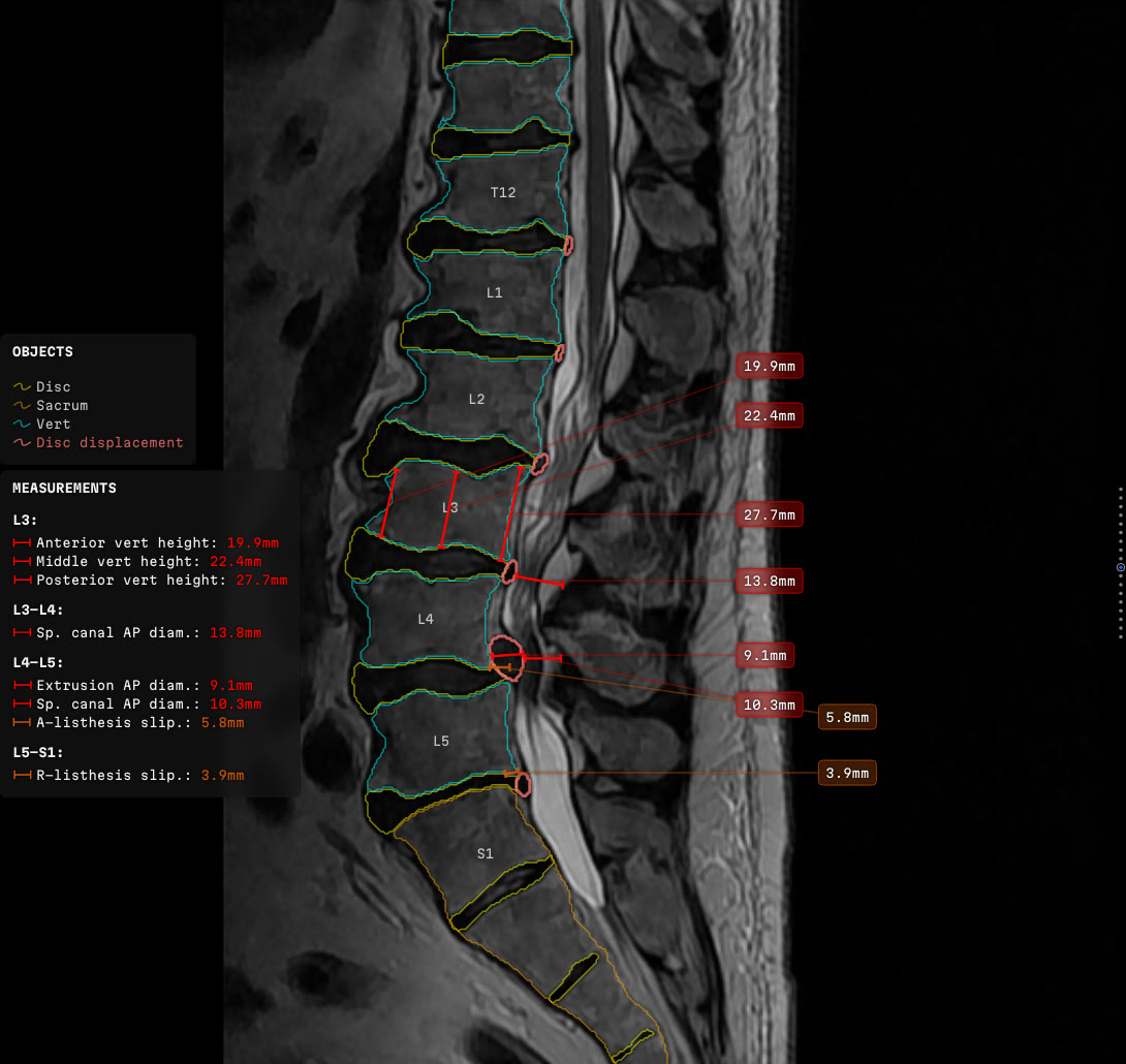
- Role
- Designed and wrote both the drawing library and the headless generator that runs it — interface, graphics, logic, algorithms, implementation.
- Purpose
- So a radiologist sees every finding on the slice it came from, beside the evidence for it, and can reject any of them.
- Built with
- TypeScript · Canvas 2D · React · a headless browser for the baked frames
The idea
Drawing a line on a canvas belongs to anyone's first week. Drawing a dozen of them onto one spine slice — with numbers, panels, and a reader who has to take the whole thing in at a glance and be able to argue with any part of it — takes rather longer.
The drawing was never the hard part. The hard part is where each thing goes, inside a couple of hundred pixels of dense grey, under rules that contradict each other. Deciding which rule gives way is a question about how radiologists read, and no amount of geometry answers it.
All of it was built at Remedy Logic by the author of this post: rendering engine, layout solver, the rules that decide what may be printed at all, the configuration all three consumers read, and the headless generator that runs the whole thing over a study. Most of the effort went somewhere unglamorous — making three hosts agree. Different frame sizes, different font metrics, and one of them paging the slices backwards.
A spine MRI arrives as two stacks of slices and leaves as a paragraph of words. Protrusion at one level, stenosis at another, canal diameter in millimetres. Everyone downstream rebuilds the spine from that paragraph, with no images in front of them. Things get missed on the way. That part has been measured.
- Nobody sees it. A review in Insights into Imaging reaching back to 1949 puts the day-to-day error rate at three to five per cent, and retrospective review at around thirty. Between sixty and eighty per cent of those errors are perceptual — the finding is on the image, plainly, once you know to look.
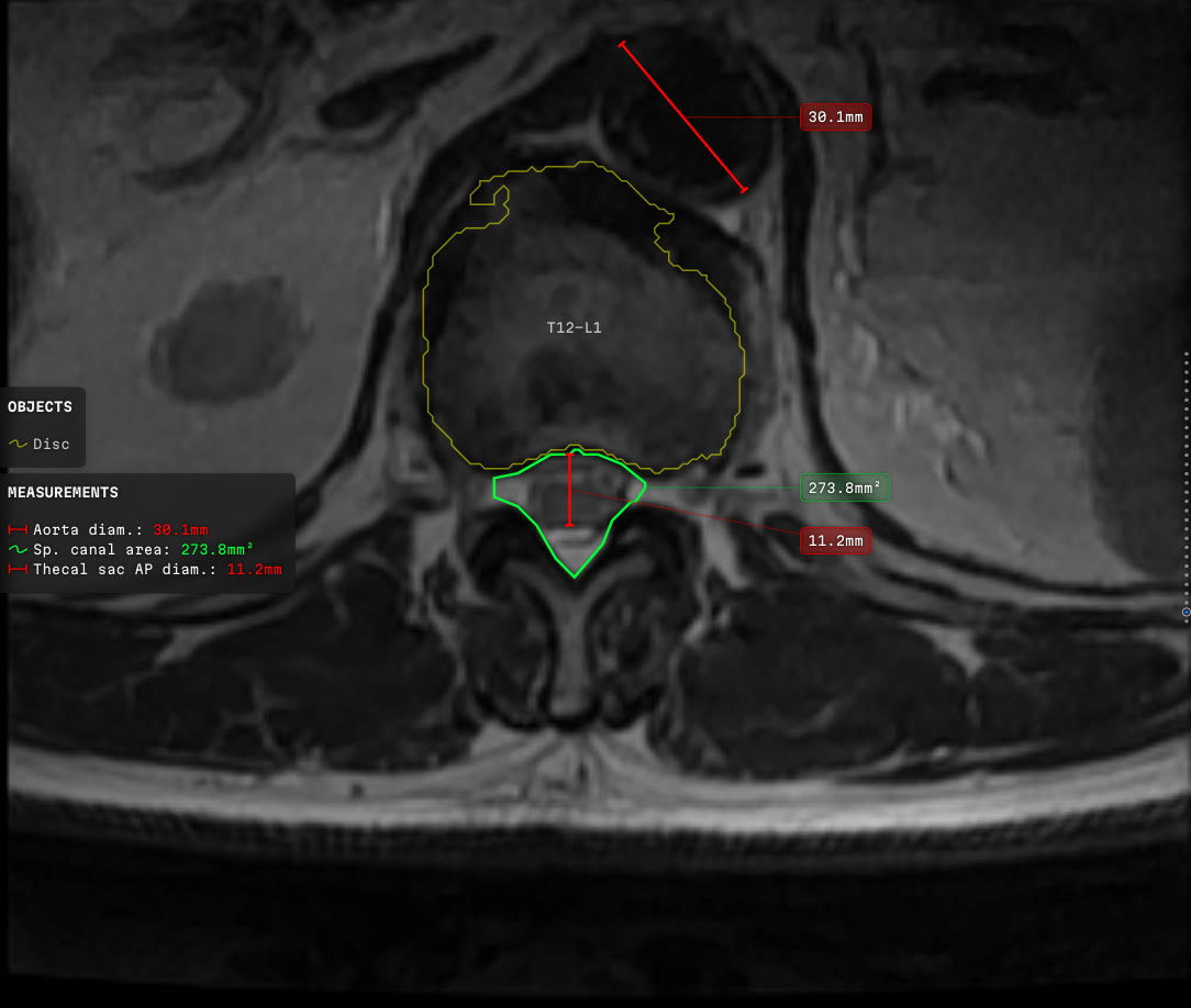
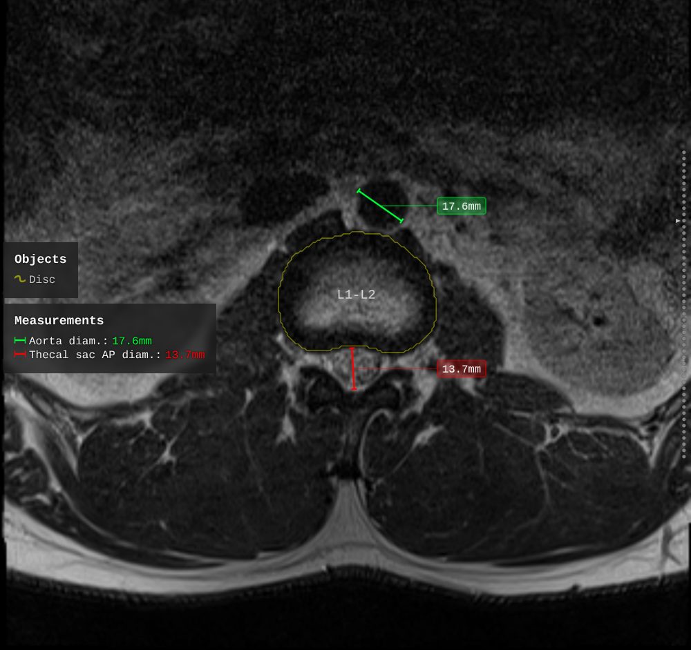
- It was there, and the study was about something else. A lumbar spine MRI contains the whole abdominal aorta. In a cohort of 1922 patients over fifty-five, an abdominal aortic aneurysm was present in 4.4 per cent and reached the report in 31 per cent of those. A separate series of 395 studies found one in 9.6 per cent, reported in 10.5 per cent. The ones missed most often are the small ones, which matter least. The gap is still large.
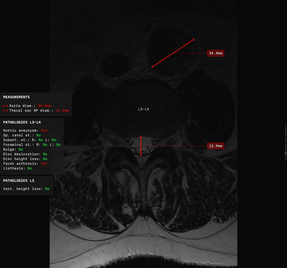 That second case, drawn. Somebody ordered a spine study; the aorta gets measured anyway. Red because the analyser put the value out of range, and the panel spells out what it means.
The analyser hunts for what is easy to walk past. It is somebody else's work inside the company, and this post is not about it. Per slice it hands over the contours it recognised — vertebral bodies, discs, the spinal canal — the measurements taken across them, and the findings with a severity attached. Numbers and polygons, and nothing in that output is a picture. Everything here begins where it lands.
What a radiology co-pilot is
The product reads alongside the radiologist and says what it saw and where — including the finding the reader has not got to yet. The radiologist still decides. Deciding the finding is wrong counts. The analyser's own 510(k) summary puts it plainly: the outputs "are reviewed, analyzed, confirmed or corrected by the user before any such content is included in the user's final report". Almost every rule below comes out of that one sentence.
An assistant you cannot disagree with is one you must either trust blindly or switch off.
Three things follow from it:
- The evidence for each finding stays on the image.
- Every finding the analyser hands over gets drawn.
- The labels stay off the anatomy they describe.
The reader is never simply told there is something at L4/L5. They are looking at L4/L5, with the measurement drawn across the thing it measures, in a colour that has already said how bad it is. Claim and evidence, one glance.
Plenty of products print numbers on the frame. The difference is where.
- Siemens AI-Rad Companion MSK, Nanox.AI HealthOST and Avicenna CINA-VCF Quantix all work on CT and measure one quantity, repeated down the levels: vertebral body height. The values sit in a column beside the spine, each row lined up with its level. No leader lines needed — the shared row does the joining.
- CoLumbo, out of Smart Soft Healthcare in Varna, does something harder. Several different kinds of measurement on the anatomy of a spine MRI slice, each printed on the caliper that took it. No leader lines there either.
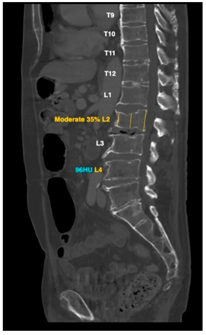 Nanox.AI HealthOST on a sagittal CT. Level names down the spine, a value only where a vertebra was flagged, parked in the empty margin beside it. From Mathew et al., Diagnostics 2025, CC BY 4.0.
A column beside a stack of levels is hardly a placement problem. The levels are already stacked, the margin is empty, and there is more room than anyone needs. The problem in this post starts when a dozen measurements of different things all converge on one dense slice.
What is drawn, and what each thing is for
Outlines say which structure the analyser thinks it is looking at. Contours rather than filled masks, because the anatomy underneath is the whole subject of the claim and filling the shape hides it. Draw the outline instead and a bad recognition is obvious at a glance.
Linear measurements run across the thing they measure. The value is the finding; the line is the proof it was taken in the right place. Areas are polygons under the same obligation. Angles describe alignment — the one quantity nobody eyeballs reliably.
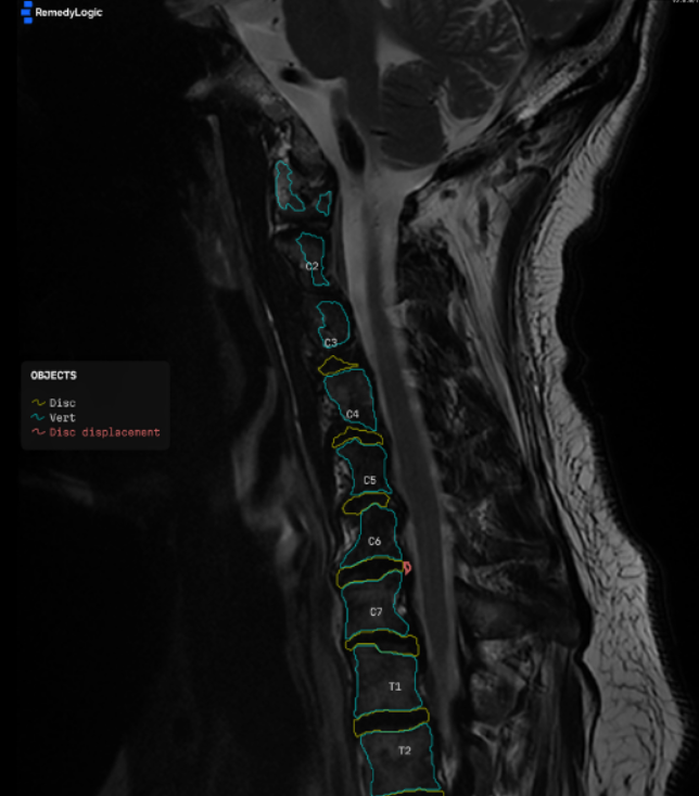
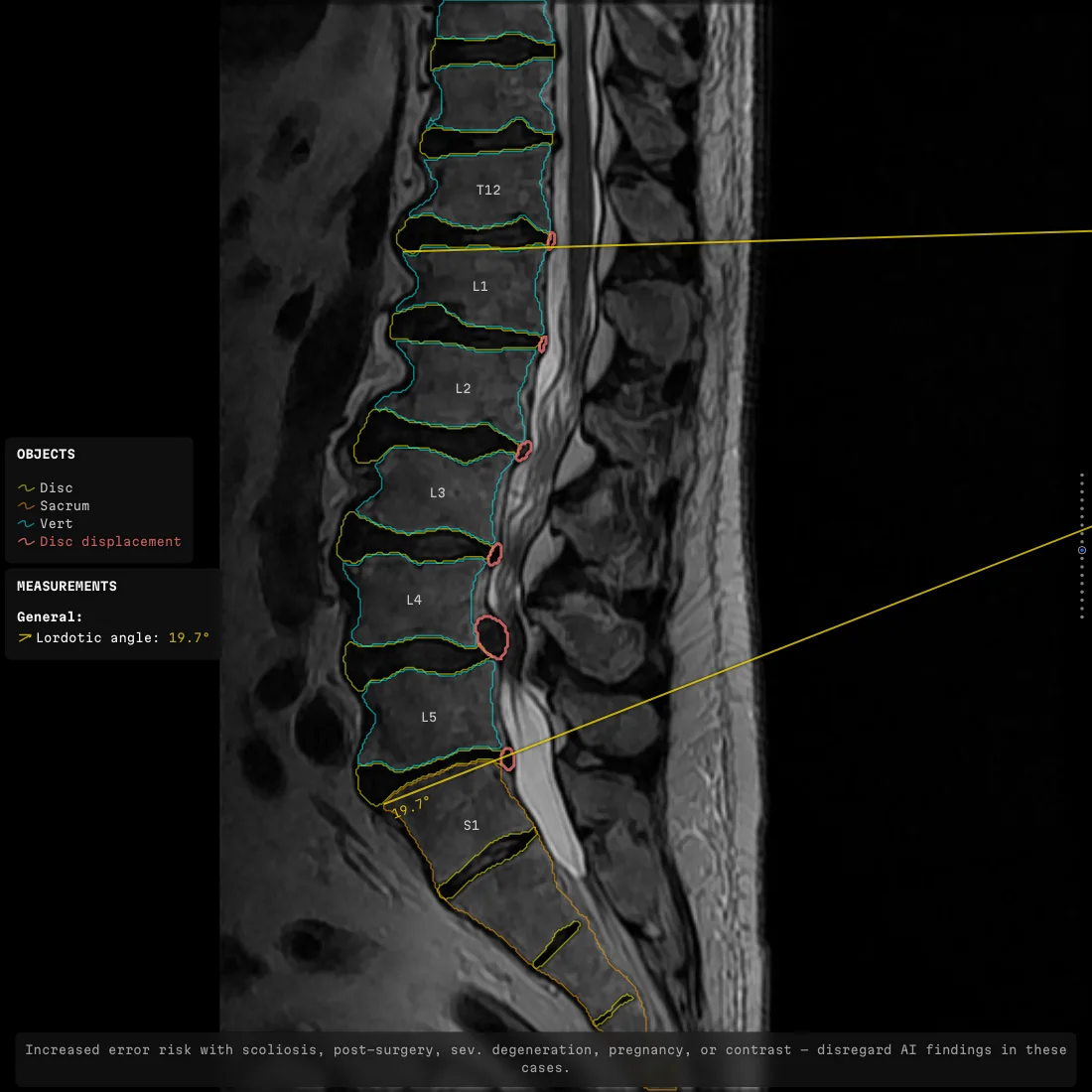
Colour carries severity, and carries nothing else. The visual system sorts colour before attention arrives, which makes it the loudest channel available. It can be spent once. It gets spent on the grade.
The findings panel says in words what was found at this level, always in the same corner, so reading it becomes a habit instead of a search. The navigation strip shows where the slice sits in the stack; without it people scroll straight past the level they were hunting for. Level marks and notices round out the set. Every value prints as measured — full digits, in the slot the layout gave it, on every slice that has one.
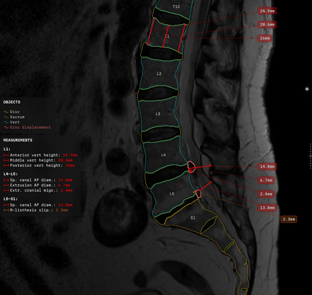 Everything switched on at once: contours, level names, eight measurements led out to two columns, a colour legend, a panel of values, and the strip marking which slice is on screen.
Every layer switches on, off, recolours or reshapes from the configuration, with no code involved. The base ships with almost all of it off, which is how one document serves three products that each want a different picture.
The picture is not an illustration of the result. It is how the result is delivered.
How it reaches the reader
The picture arrives inside the viewer the radiologist already has open. Frames get rendered once, ahead of time, and packed into a series that sits beside the original study — that is how most readers meet it. The other path draws the same overlay live, on a viewport somebody is panning and zooming. Those two paths have to produce the same picture to the pixel.
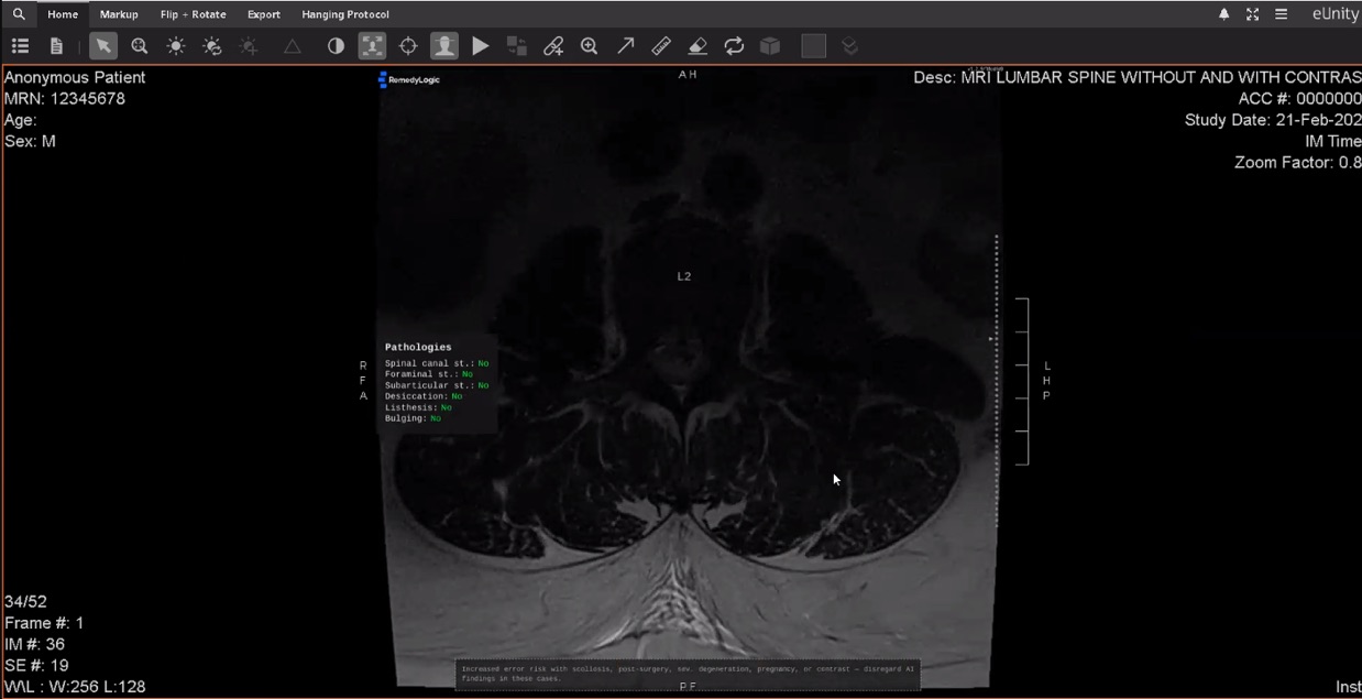 The enriched series open in eUnity. From the viewer's side it is one more series in the study. Nothing in that interface was built with this in mind.
What no container will carry
A measurement counts for nothing until it reaches the radiologist inside the viewer they already work in, and that only happens if the overlay is a picture. The imaging standard does have objects built to carry annotations. Each of them refuses one half of the job:
- One-bit overlay planes carry a stencil — one bit per pixel, so everything drawn on them comes out the same single colour.
- Segmentation masks express filled regions and only filled regions. There is no way to say an arrow, a number or a panel in one.
- Vector presentation formats carry geometry and text as objects, which is semantically the right answer, and almost no viewer in the field will show you one.
All three run into the same limit. A single instance carries either colour and rich graphics, or values you can still measure — never both. Burning the overlay into a frame turns measured densities into display pixels, and two safety rules come out of that:
- The enriched series is always additional. A study whose measurable pixels had been overwritten by a drawing about them would have lost the quantities the drawing discusses.
- It announces itself. A series a radiologist could mistake for the original is a defect.
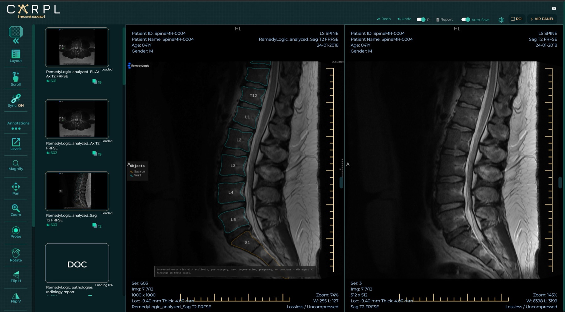 Enriched series on the left, untouched original on the right, inside CARPL. Two ordinary series of one study, in a platform that carries many vendors' models.
What the clearance changes
The analyser is a cleared device. The 510(k) record is public — K241108, the Remedy Logic AI MRI Lumbar Spine Reader, decided 30 October 2024 under the class for automated radiological image processing software, announced that November.
The clearance sits on the analyser. The drawing carries none of its own; it renders the values the analyser produced, exactly as they arrived. Change one to make the layout tidier and it stops being that number. Which turns three rules that would otherwise read as fussiness into something firmer:
- Print the value at the precision it was measured at.
- Keep it beside the thing it measures.
- Find room for every label, however crowded the slice is.
A cleared measurement that the layout rounded to fit is a different measurement.
Nothing off the shelf places labels
The missing product is a placement system.
Three ways to put a number on a scan
Three ways to get a value next to the anatomy, and what each gives up. The comparison is about drawing, taken from published images, and it says nothing about how well any of these products recognises a finding.
The bare-image strategy deserves more respect than it usually gets. Every pixel of anatomy stays visible, every measurement survives in the table, and the layout problem never comes up at all. What it costs is the link. A number in a table is joined to its structure by a level name and a reader willing to match them up. Keeping that link visible on the image is what buys every difficulty below.
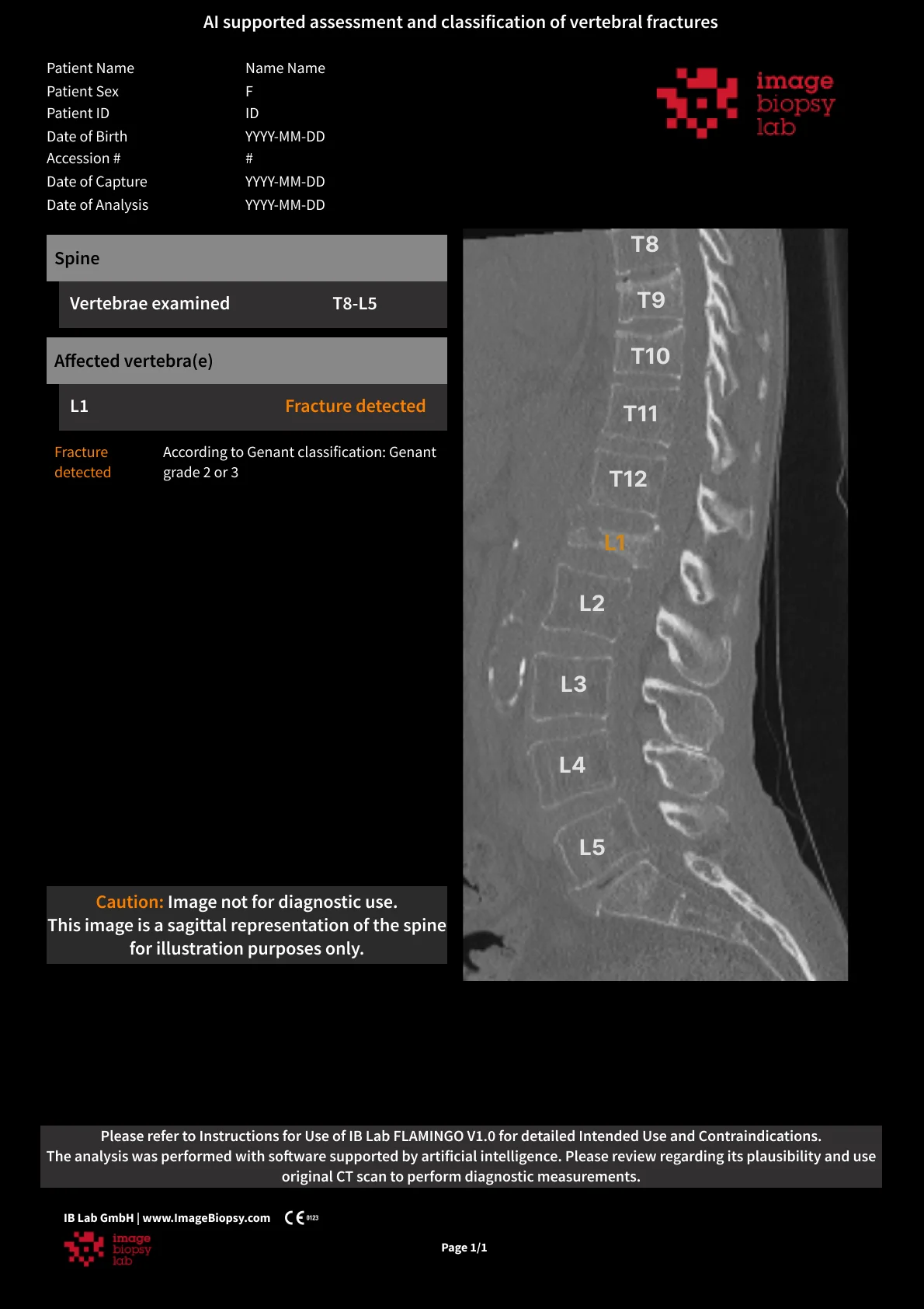 That strategy taken all the way, in IB Lab FLAMINGO's own report. The image carries level names and one colour; the finding and its grade live in the table. Nothing is covered. Nothing on the image says what was found, either. From imagebiopsy.com.
CoLumbo puts each value on the caliper itself, with no leader out to a column. Its own published frames — the dural sac area and herniation size pages — show what that costs once several measurements land together. Described here rather than reproduced, since the frames belong to the vendor:
- A value plate sits over the green outline of the disc.
- A number inside the dural sac is crossed by two nerve-root contours and cannot be read.
- A value lies along the slice line.
- A plate lands on the series text the scanner burned into the image.
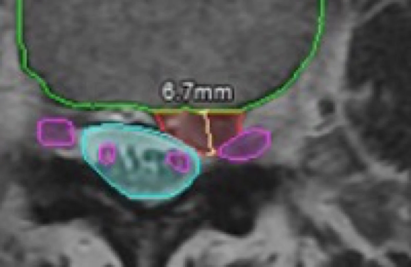 The first two, on a single axial slice. 6.7 mm printed straight across the green disc outline, and the area inside the dural sac crossed by two nerve-root contours until the digits are unreadable. From columbo.me.
That is what happens when a number's position is decided entirely by the position of its measurement. All four of those failures are impossible here, by construction. A value is never drawn on a stroke. Everything already on the frame — anatomy, level marks, panels, labels that got there first — declares the room it takes up before the first label is placed, and any arrangement that lands one thing on another is thrown out before it is even scored. Which leaves leader length as the only thing to trade, and leader length is a preference.
The direction of travel shows up in that product's own history. Figures in its 2021 validation paper fill the anatomy with opaque colour and carry no number on the frame whatsoever — every value sits as a line of text under the picture. Five years later the values are on the anatomy.
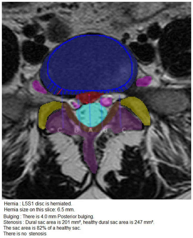 The same product five years ago: filled masks over the anatomy, every measurement written out as text below the image. From Lehnen et al., Diagnostics 2021;11(5):902, CC BY 4.0. Since then it has moved them onto the anatomy, and walked into the problem this post is about.
Four rules that cannot all hold
Take an axial lumbar slice — the transverse plane, where the disc, the spinal canal and the nerve roots all appear together. A couple of hundred pixels of dense, structurally similar grey. After the analyser has been through it, a dozen calipers inside that. Every one of them wants a legible label near its own point, and four rules decide where it may go:
- No two labels may overlap.
- No label may sit on the anatomy it describes.
- No leader may cross another.
- Every label has to be drawn.
Any one of them is easy. All four at once is the entire problem.
Contours are the easy half. A contour sits where the image put it, and two contours never argue about which of them should move. A label has no place on the image at all — its position is chosen, and every choice takes pixels away from something else. One contour plus another contour always works out. Ten labels on ten leaders is a packing problem, and on a dense slice it may have no solution at all.
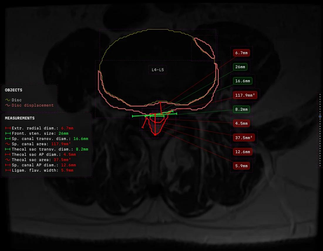 That case, solved, with the layout guides turned on. Nine measurements of seven different quantities on one axial slice, all led out to a single column, no leader crossing another. The dashed rectangles are the room each object claimed for itself.
The four rules also come from three places that cannot check each other. Whether an arrangement exists at all is geometry. Which rule is the hard one comes from how a radiologist reads. What may be shown at all comes from what the imaging formats will carry.
How a crowded picture is read
The eye fixates, takes in a small sharp region, jumps, and throws away everything in between. A label beside its measurement falls inside the same fixation and costs nothing. A label at the far end of the frame costs a jump out, a jump back, and holding a number in your head across both. For one number.
How the labels group is settled by the clinical question. A reader wants the same quantity at adjacent levels — canal diameter down the lumbar spine, disc height above and below. Six numbers each clinging to its own point make six separate searches. The same six gathered into a column make a table: one region, one movement of the eye.
Occlusion is the one rule with no acceptable amount of violation. A label printed over the anatomy it describes destroys the evidence for its own claim — the reader cannot check the measurement, because the number is standing on it. In most software that is a cosmetic defect. Here it is a finding nobody can verify, and therefore one nobody can disagree with.
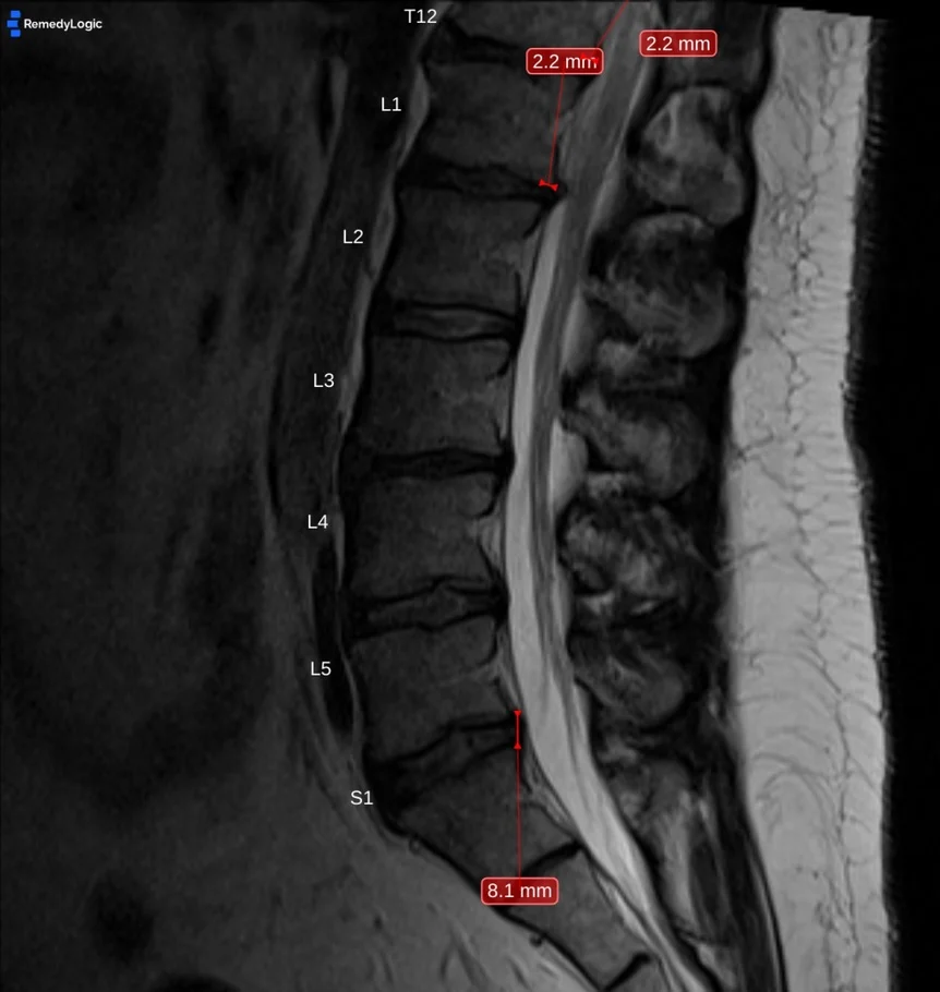 Two measurements of the same size pull their leaders towards one point, and one label has been pushed out of the frame to make room for the other.
Middle-out
The first version did not search for anything. It offered a label forty-two successive positions down the frame, took the first one that fitted, and if all forty-two failed, the label simply was not drawn.
The outcome the rules exist to forbid was the one the code fell back to when it ran out of ideas.
The replacement had labels radiate out from the centre of the frame, each travelling away from its own measurement until it hit clear space.
Middle-out.

It looks orderly. That is the trouble with it. A label buys clear space by paying in leader length, and a longer leader crosses more neighbours on the way out. Sending every label as far out as the frame allows maximises the quantity that needed minimising. It was built, it looked right, and it was wrong.
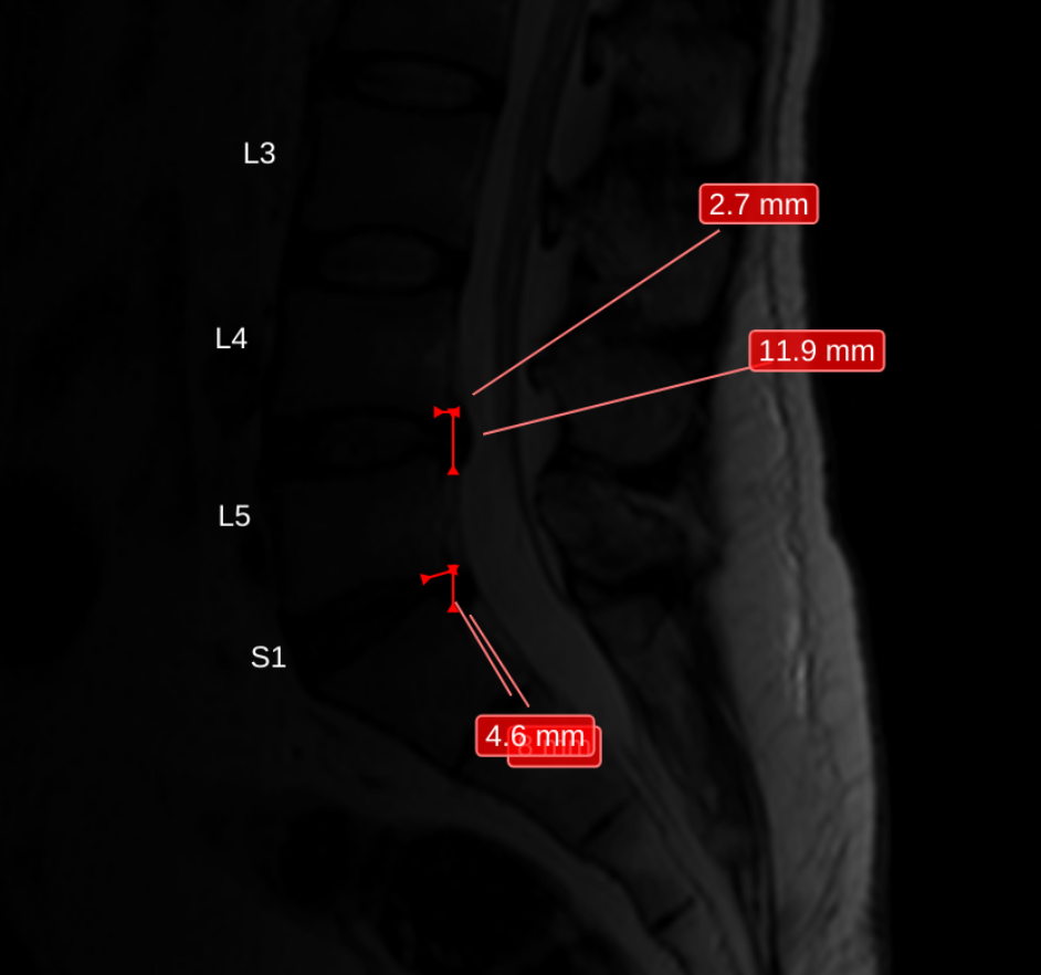
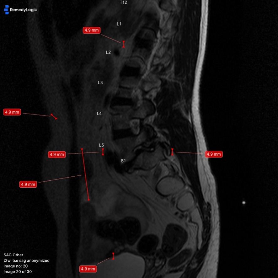
Next came letting a crowded label leave its column and go find its own room. Every iteration produced a better single frame and a worse stack — the same measurement landed somewhere different on consecutive slices, so anybody scrolling the series had to hunt for it again at each one. It was deleted. A predictable crowd beats an unpredictable position.
Searching instead of trying
The forty-two tries gave way to an actual search. There is no formula for a position — the constraints contradict each other, so any closed form that satisfies one breaks another. What exists is a space of arrangements, most of them bad, and the work is searching it against two tiers and a known order of sacrifice, declared once instead of argued out at every site:
ranking: # how a whole arrangement is judged, top down
  refuse: [leaders_crossed, plate_on_shape]
  concede: [leader_over_reading, leader_over_plate]
  settle: [longest_haul, haul_evenness, haul_sum]
budget:
  reseat_rounds: 9 # how often one plate may be reseated
  step_rungs: 5 # how far along the ladder it may be pushed
  exhausted: return_best_seen # never empty, never an error
Refusals outrank concessions, and inside the settling terms the longest single haul outranks how evenly the hauls are spread.
The order inside the settling terms runs against the obvious answer. Score the spread first and "push everyone equally far" beats "leave almost everyone where they are", which is backwards. A reader will put up with a crowd of short leaders and will not put up with one number exiled across the frame, so the longest single haul gets scored first. The search is bounded at nine reseats and five rungs, and returns the best arrangement it saw. On a lumbar slice there is frequently not enough room, and what goes first is settled before the search starts.
The first form of the search took the first arrangement that satisfied the hard rules. Perfectly reasonable, and it produced visibly worse pictures than it had to.
A satisfying arrangement is not a good one.
The layout is scored as a whole composition now, and the search hands back the least damaged arrangement it found instead of the first admissible one.
The first scoring counted violations and accepted any move that lowered the count. Lowering the count and helping turn out to be different things. On a real slice it spent a fifth of the picture dragging one measurement past the sacrum to spare its leader a single plate, while the measurement next to it, at the same level, sat quietly beside its own caliper. Now the reader has to work out which caliper the exiled number came from, and the crossing that bought would have cost nobody anything. Repairs have a price ceiling these days. Getting a label off the anatomy it describes is exempt, because that one is not a matter of degree.
Order, not room
Labels gather into columns, so every leader in a column arrives on the same vertical. For any two labels in that column, whether they cross comes down to whether the pair sits in the right order. It is a property of the assignment, and room has nothing to do with it: two labels can have the whole frame to themselves and still cross.
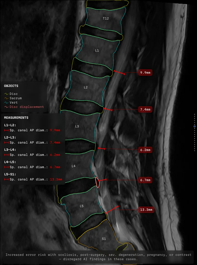 Five measurements, five labels on one vertical, nothing crossing. The reader runs down the column once instead of hunting five numbers across the frame.
Nobody counted crossings at all. A comment in the code asserted that sorting labels by the height of their points made a crossing inside a column impossible, and on the strength of that one sentence, crossings were never counted. The premise is false. How far out to the side a leader starts also decides its path, so two points at the same height and far apart horizontally come out tangled. Nothing counted, so nothing complained.
The repair is small. Take a pair, swap the slots they hold, and keep the swap only if the total number of crossings went strictly down. A column that was already clean comes out identical, which is what made it safe to ship.
Order settles which slot a label takes. Where the column of slots stands is a separate question, and the anatomy answers it, not the window:
ladder:
  lanes_per_side: 4 # verticals available on each side
  stands_off: anatomy # pinned to the shapes, not to the frame
  gap_from_anatomy: 24 # clearance from the outermost shape, px
  lane_width_percent: 130 # of the widest plate in it, margin included
crowding:
  never: compress_gaps # the space between plates is never taken
  outer_lane: folds_inward # it collapses, its plates move in
  inner_lane: pulled_off_wall # the last one steps back from the edge
Where a column stands is decided by the anatomy. How many columns fit is decided by the frame.
Away from the line
When a label will not fit where it wants to be, it moves away from the measurement line, and only away. The leader then leaves at a sensible angle instead of doubling back over the thing it is pointing at.
The rule went through five versions. Each one was a reaction to something a check turned up, and none to anything the design had predicted. The version that read best on paper spread a column symmetrically about its anchor — least total movement, the obvious answer. An independent pass found every hard rule satisfied and exactly one thing wrong: symmetry had moved the label nearest the measurement thirteen pixels towards it. What shipped pushes every label one way, and comes back towards the line only as a last concession.
A moved label pushes its neighbour, which pushes its own, and the displacement carries on down the column, so the rule has to hold at every step — otherwise somebody four places along gets shoved towards the line by a decision taken about somebody else.
That defect survived the planner being taught to compute the direction correctly, because the rendering layer was re-seating labels on an unrelated criterion and quietly overruled it.
The planner enforced the rule and the renderer did not, so the rule was not enforced.
What a label has to go round
What a label has to avoid is declared on the thing being avoided, as a single number:
vertebra: { clearance: 14 } # go round, and hold 14 px clear
disc_quiet: { clearance: ~ } # not an obstacle: write over a calm level
disc_bulging: { clearance: 0 } # hug the outline, which is not off
board_left: { clearance: 5 } # a panel obstructs like anatomy
caliper_arm: # no key at all -> the margin comes from the kind,
  kind: reading # never from zero, because forgetting must not disarm
Zero means hug the outline. Empty means stand aside. A missing key fences the thing rather than exposing it.
That buys something nobody designed for. Labels are free to use the space over the levels nobody needs to look at, so the keep-outs end up marking where the interesting anatomy is by marking where not to write.
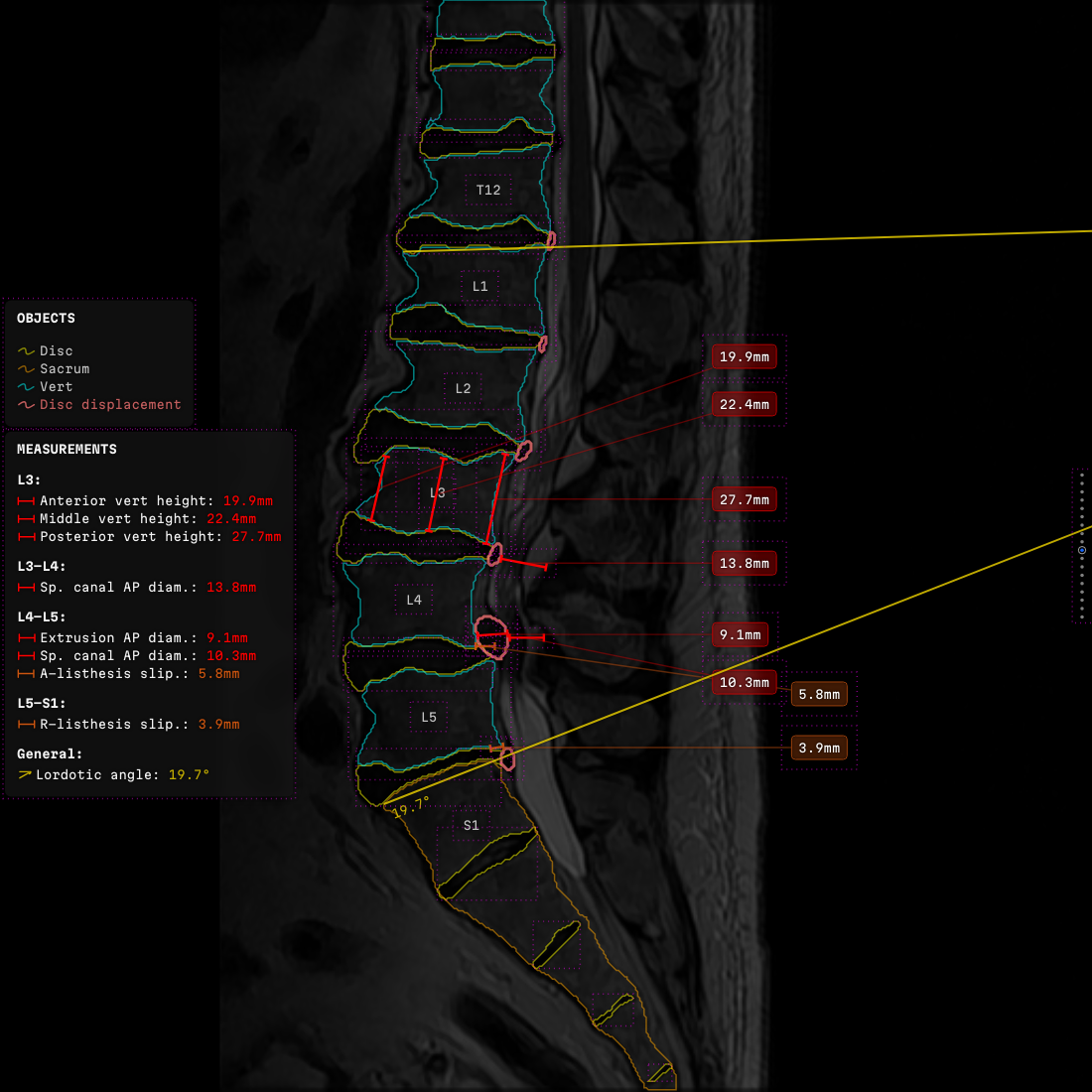 The same frame with the keep-out guides drawn on. Every object has declared a rectangle — labels and panels too — and the room left for the next label is whatever those rectangles did not claim.
Where a leader lands on a shape
An area is a polygon, and its leader has to land somewhere on its boundary. Three ways to choose that point:
- The nearest boundary point fails on exactly the shapes that matter. Give a structure a lobe reaching towards the column and its nearest point lands far above or below the label; the leader turns back on itself, runs over its neighbours, and no amount of reordering rescues that pair.
- The boundary point at the label's own height fails just as reliably, by wandering round to the far side of the shape.
- A cost, instead of a distance, works. Vertical offset traded off against horizontal reach, so the chosen point sits on the side facing the label, at a height the leader was going to pass through anyway.
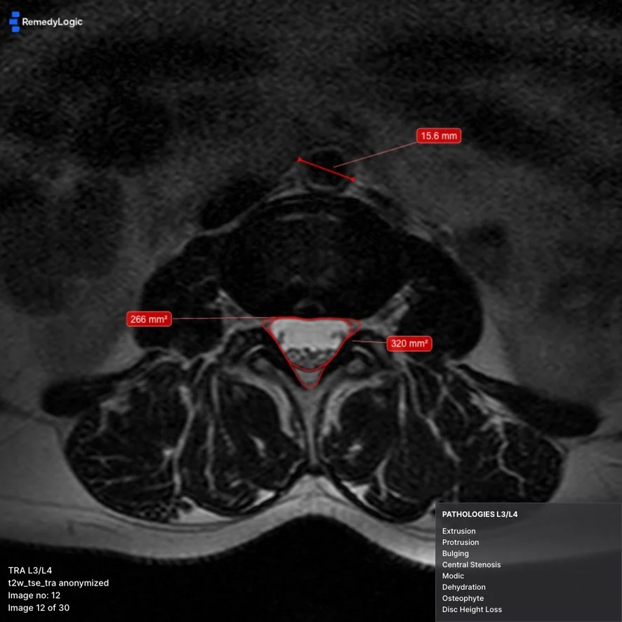 Two nested outlines, areas led out to opposite sides, each leader landing on the side of the boundary that faces its own label. The findings panel sits in the same corner on every slice, so a reader scrolling a stack learns where to look once and never again.
One picture, three hosts
The three consumers live in different worlds. The headless renderer picks its own frame size. The live viewport takes whatever area the page's layout left over, and then that area gets panned, zoomed and resized under it. The browser viewer sits somewhere between the two.
The library sits inside somebody else's environment at both ends. Underneath, viewers built by other people, OHIF among them. Above, the reading pipeline Remedy Logic ships to its customers. Which gives the requirement, and it fits in one sentence: the same study with the same configuration produces the same picture in all three, to the pixel. If a host needs an adjustment to match the others, the contract is broken, and the contract is what gets fixed.
One host-specific adjustment, and the three outputs stop being the same picture.
The drawing surface is a 2D canvas, because pixel identity across those hosts is a bitmap problem and the canvas is the one surface all three share. Text measurement comes out of the canvas itself, which means it depends on the platform's rasteriser and on whether the font finished loading. So the font ships inside the library, as part of the drawing contract.1
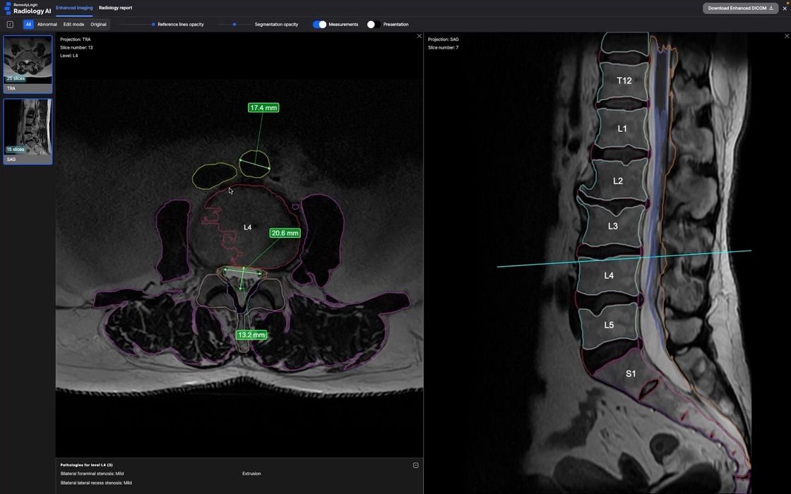 The live path: the same drawing code over a viewport the reader pans and zooms.
What it needs from a host is short enough to list:
- Somewhere to put its own canvas over the picture.
- A live conversion from image pixels to the screen.
- A change signal frequent enough to redraw inside the same frame the host is drawing.
Every canvas viewer in imaging has all three already. A viewer built on Cornerstone hands them over unmodified, so the overlay drops in as an extra layer instead of a fork of the host. It stays a separate surface over the original DICOM pixels. The source series opens the way it always did, and switching the overlay off leaves the study the host started with.
That last one — a change signal on every frame — decides whether a given host is possible at all. An embedding that reports a change only once the slice has settled fails — with no per-frame tick to draw against, the overlay arrives a beat behind the image every time the reader drags. That is a property of the embedding mode, and no particular viewer is to blame for it.
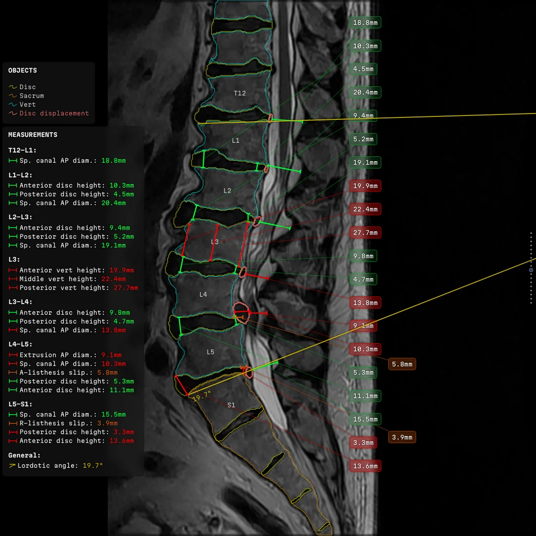
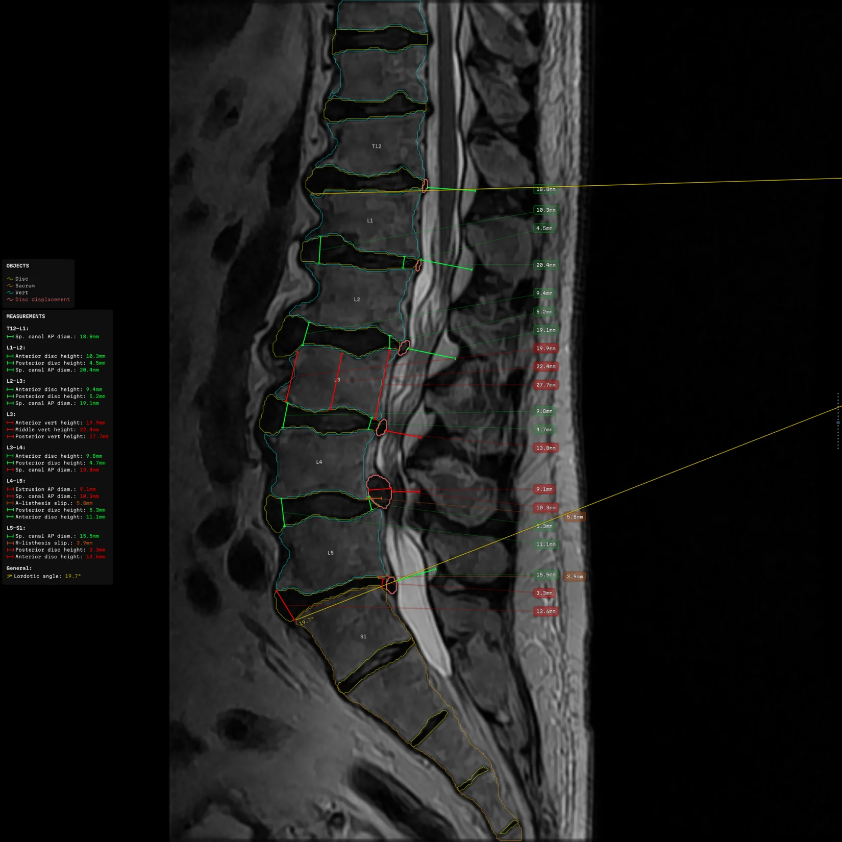
Panels that used to move
Everything on the frame used to negotiate for space, and getting the findings panels to behave took more attempts than anything else in the project. Five of them, in order:
- Throttle the movement.
- Wait for the canvas to settle before committing to it.
- Prefer a vertical escape to a horizontal one.
- Re-align a panel after it jumped to the opposite wall.
- Animate the journey so it did not teleport.
None of them converged. A panel would jitter when the slice moved by a single pixel, or stop short as though waiting to be pushed harder. Deleting the mechanism beat tuning it a sixth time. Labels and their leaders move now, and nothing else does — logo, notices, strip and panels all stand fixed, and a panel is a static region that labels route around. Mutual shoving, the most expensive part of any layout solver, went out with it.
Deleting the mechanism removed the jitter, the stopping short, and the mutual shoving, in one commit. Tuning it had not, across five attempts.
The strip that ran backwards
The navigation strip ran backwards: right on sagittal series and inverted on axial, or the other way round, depending on which host was drawing it. Two geometric fixes failed in turn. The plane's normal points in opposite senses for the two orientations, and no global choice of direction agrees with the reader's scroll on both.
The live viewer stacks slices its own way and is the only thing that knows how. The baked series is paged in the order it was generated. A drawing library can arrive at either one only by guessing, so it draws the strip in the order it was handed the collection, and the public helper for anatomical ordering was removed. The order of a list is an assertion the caller makes.
The bug survived as long as it did because an old sort had been quietly reversing every sagittal series while staying harmless on the transverse ones, where the order came out right by accident. Half the cases looked correct. Every report was therefore about the other half, and the sort itself was never suspected.
Two quantities, two spaces
One configuration has to produce the same picture on studies of different resolution, in hosts of different size. That sounds like a single scale factor. It cannot be, because two kinds of number live in the same file:
caption: # authored — keeps its size whatever the study
  type: { size: 17, leading: 21 }
  plate: { pad: 6, corner: 3 }
anatomy: # from the image — scales with the raster
  outline: [[121, 88], [130, 84], [138, 91]]
  caliper: { from: [118, 96], to: [140, 96] }
Everything under caption is authored. Everything under anatomy names a place on the image.
Scale the authored half by mistake and a study at twice the resolution renders the same text at half the apparent size. That reached a rendered frame once: an enormous vertebral body with microscopic labels stuck to it. Caught before the frames went anywhere.
The fix was to make the two impossible to mix up while writing the code, and the same treatment covered every other space the library works in. The analyser's pixels, the layout's own units, the screen, the device — each went into the type system, each with its own type and a named conversion as the only way across. Use a number from one system as a number from another and it no longer compiles. Apply a conversion twice, or skip it, and the same. Every placement bug this library ever had was a quantity used as though it belonged somewhere else, so making that unrepresentable retired the class instead of the instance.
The tests had been hiding that class instead of catching it. Every stub held the second of those conversions at one — the value the headless renderer uses, where the conversion is the identity. A placement quantity that skipped it looked correct in every test and came out about a fifth off in a browser. The measured values were never touched. What moved was the label carrying them: the same overlay laid out two ways depending on where somebody opened it, which is the one thing the contract exists to forbid.
The tests ran in the one coordinate system where the error is zero.
The fix landed in the tests rather than in the drawing — a stub that makes the factor a knob, and a matrix that runs both axes together.
The configuration is the product
What each label says, when it is worth saying at all, which word carries which severity and in which language — all of it lives in one configuration that the library publishes as part of its public interface. Consumers lay their own overrides on top, and how the two fold together is part of the contract:
base: # shipped with the library
  board: { draw: true, corner: topRight, pad: 6 }
  notes: ["check the level", "check the side"]
layer: # one consumer's own
  board: { corner: bottomLeft }
  notes: ["one message of its own"]
folded: # what the reader gets
  board: { draw: true, corner: bottomLeft, pad: 6 }
  notes: ["one message of its own"]
Maps fold key by key, so the consumer changes one corner and inherits the rest. Lists are replaced whole, because a list of messages is one statement rather than a pile of items. A scalar overwrites even when it is false, 0 or empty — those are values, not absences.
The fold ships in the library, pinned by a test. If each consumer wrote its own, identical layers would produce different pictures.
Pixel identity does not begin at the drawing. It begins with all three consumers folding their configuration the same way.
The base draws nothing at all. Of its 329 visibility switches, 263 are off, and the message list is empty. The base is the vocabulary; the consumer writes the sentence. Eleven prepared appearances live beside the product and switch over on the fly from workplace settings.
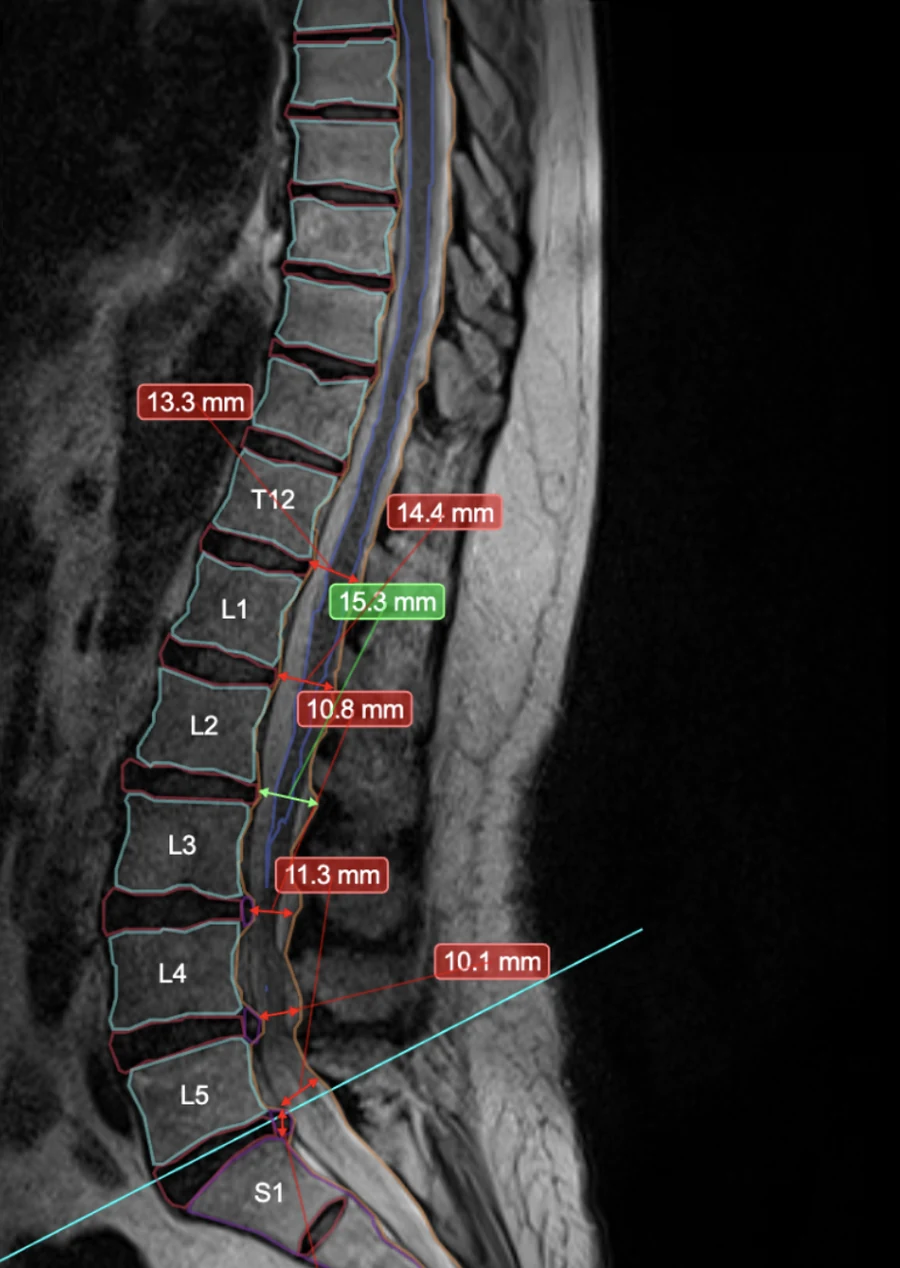
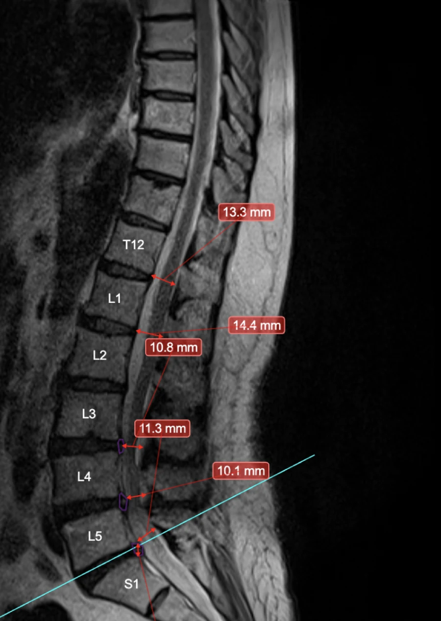
What a finding is made of
Nineteen findings are described, split by projection: five sagittal, fourteen axial. Ordinary vocabulary for a spine report — the stenoses, disc bulge, protrusion and extrusion, disc height loss, degeneration, displacement. Each one carries its templates, its severity table, the gates it has to pass, and where the sentence needs them, dictionaries for side, direction, location and cause. The fragments below use stand-in names:
someWearAndTear:
  drawOn: [oneProjection] # gate 1 — this projection
  ridesOn: oneKindOfLevel # gate 2 — a disc level or a bone level
  printFrom: 1 # gate 3 — this band or worse
  bands: # word and colour arrive on one row together
    "-1": { word: undetermined, ink: neutral }
    "0": { word: none, ink: calm }
    "1": { word: mild, ink: caution }
    "2": { word: severe, ink: alarm }
Three gates and one table. A finding that fails any gate is not drawn, and one that passes takes its word and its colour from the same row.
The scale runs from −1 to 4, where −1 means undetermined and prints grey. The same grade means different things in different findings. One table turns 1, 2 and 3 into mild, moderate and severe; another turns all three into "yes", because clinically only the fact matters there. The colours are tokens declared once, so the whole product grades on one palette.
 Two colours on one slice are two severities. The value on the anatomy and the same value in the panel are painted from one row of the grade table, so the two cannot disagree.
The gates run the other way too, and the overlay deliberately draws less than it is handed. A measurement comes off wherever the drawn line would misrepresent the anatomy under it — on axial slices cut at a strong tilt, a distance across the slice is a different quantity from the distance across the structure.2 Drawing everything the source offers would put 8.9 per cent more measurements and 3.8 per cent more text on screen, counted over thirty-eight studies. They stay off. A line a reader cannot check against the anatomy beneath it is worse than no line at all.
Where it gets hard
A stenosis is more than a name and a grade. Its two sides are graded independently and printed on one line, and the right can be severe while the left is mild. The nerve root compression that follows from it is a consequence rather than a finding in its own right, so it goes on the line below, indented, under a plus sign. It takes three mutually exclusive forms — right, left, bilateral — written out as three separate sentences instead of one with a word swapped in, because bilateral names neither side. Its cause arrives from a different finding altogether, and can differ between the two sides.
 One level's findings as the configuration words them. "Bilateral" names neither side, which is why it is a sentence of its own. Two of the five carry no grade, because for those findings only the fact is reported.
Each side carries its own threshold, so one can be dropped while the other prints, and the sentence is chosen from a conditional list, first match wins:
sentences: # first match wins
  - onlyIf: { flank.0: overFloor, flank.1: atFloor }
    reads: "{{flank.0.name}} <finding> at {{rootName}}"
  - onlyIf: { flank.0: overFloor, flank.1: overFloor }
    reads: "bilateral <finding> at {{rootName}}"
  - reads: "" # both flanks under threshold: nothing prints
The template never says left or right. It names the two flanks by number, and a separate table decides which field of the verdict each number reads.
A disc sits between two vertebrae and can compress two different nerve roots: the exiting one above and the descending one below. One table of names covers both. The engine takes the printed level name, cuts it at the separator and keeps the half it was asked for, so L4-L5 plus 0 gives L4 and plus 1 gives L5. One digit decides which root the sentence names.
Markup was tried first
The off-the-shelf answer went in first. Panels, notices and strip as ordinary page elements sitting over the picture, with markup handling the text layout. That holds up exactly as long as the picture appears in a browser you control. A headless render leaves the markup with nowhere to live; another vendor's viewer does the same. So the panels came off the page and into the canvas, and everything markup had been doing for free — wrapping a line, measuring it, drawing a plate behind it — got written from scratch.
Colour lives inside the line rather than around it. The template marks up the severity word alone, so "right mild, left severe" prints two words in two colours inside one sentence. A canvas will report the width of a string and paint a string; everything above that belongs to the caller. Two colours in one sentence therefore mean the library carries a typesetter of its own:
- A parser for the markup.
- A line breaker working in measured widths rather than in characters.
- A measurer that asks the canvas for the width of every run.
- A painter that walks those runs back out in order across the plate.3
Measurement and drawing are one pass, so the font measured is the font drawn. Two passes allow a plate to be sized against one font and filled with another.
Localisation is not translation
Every value a reader sees is written either as a plain string — the same in every locale — or as a map from locale to text. Severity words, side labels, cause names and level names can each take either form. One resolver reads both, so moving a field from one form to the other is an edit to the configuration and nothing else.
A missing translation used to make it all the way to the glyph. Inside a conditional branch it resolved to an empty string and the line vanished from the frame. In a plain localised map it fell through to string coercion and printed literal machinery where a sentence belonged. Same family as the panel header that once rendered the word UNDEFINED. Both are fixed at the resolver, which is where a missing value has to stop.
The clinical risk sits in the notation. The analyser names a level one way, the printed name says it another way, and the level table bridges the two — fifty-one levels per projection, cervical spine down to the sacrum:
levelBook:
  aDiscLevel:
    spelling: { en: "Xn/Xm", de: "Xn/Xm", nl: "Xn/Xm" }
    roots:
      upper: 0 # the half before the separator
      lower: 1 # the half after it
One table carries both notations, and the root is cut out of the printed, localised name.
A locale that wrote the level with a different separator would send the nerve root to the wrong level, not merely change the caption.
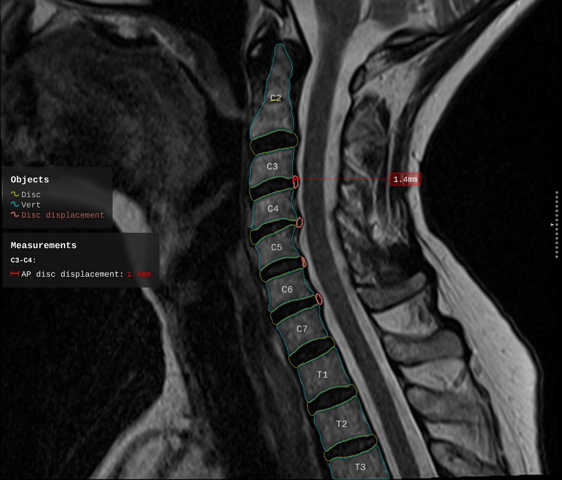 The names down the spine and the level named in the panel come out of one table. The single measurement is led out to the right edge because nothing nearer was free.
The service that photographs it
The generator is what turned this into a library: a headless service with no interface, running in a private cluster. It takes the analyser's verdict and a configuration, raises a virtual browser, draws the overlay on every requested slice, photographs it, and hands the frame back. Those frames become the series waiting beside the original study — which is how most radiologists meet the overlay at all.
It draws in a browser because the picture has to match to the pixel in three places, two of which are real browsers. Rendering on the server would mean a second implementation of the same drawing: another font rasteriser, other text metrics, other antialiasing, and guaranteed disagreement with two consumers out of three. The page it photographs is the page a developer opens by hand to look at a slice. One drawing path, two doors into it.
The whole engineering problem of that service is holding a browser, a queue and a clock together long enough to finish a study. It produced the hardest defect in the project to see.
The server used to find out that a slice was ready by asking the page. The predicate it asked with runs on the page's main thread — the thread a heavy slice occupies completely — so for precisely the interval when the answer matters, nothing on that page runs. Measured on a real run: attempts of 8.5 to 9 seconds against a 5-second budget, other studies at 26 to 76 seconds, and one slice that outlived its own failed wait and finished at 18546 milliseconds.
Raising the budget would not have fixed the mechanism. It would have widened the window in which a broken mechanism happens to work.
The fix was to install a real function into the page and have the page call it the moment the render resolves. Waiting then depends on one thing: whether the thread will ever be free, which is the same condition as the render finishing at all.
The other half of the speed came from not navigating at all. Opening a fresh page per slice meant downloading the bundle, raising the framework and loading the fonts again every single time — 60 to 80 per cent of the run, and all of it waste on a page that is generic anyway. A pool now navigates each page once at startup and hands out hot ones. That buys about 15 per cent of the time to the first drawn slice and 12 per cent of a small job. On a large one it buys nothing.
Between two versions, ninety-six studies each: the median study went from 54.6 seconds to 31.5, throughput from 1.2 slices a second to 2.1. Median, and per study, on purpose — the number of studies in a run is arbitrary, so a total says more about the run than about the work.
Two things in the library exist because this consumer asked for them:
- Sizes separated from positions, because a server names its own frame size while a viewport is handed one.
- A named, loud drawing failure, because a server has to tell a failure from a slow slice, or it waits out the timeout and photographs a broken frame.
The service is about a third of the library's size — roughly 8500 lines against 25 800 — and carries almost as many tests, because all of its difficulty lives in the seams. It used to hold its own copy of the visual rules. Moving those into the library's configuration is what let it become a service: it stopped deciding how the picture looks, and now decides when to draw one, how many at a time, and what to do when one fails to come back.
Testing a search with no right answer
A layout has no correct answer to write into an expectation. The solver may put a label anywhere the rules allow, and improving the solver changes where. So the tests assert the properties the answer has to hold whatever it picks:
- No label lost.
- Each docked to its column, on its own side of the vertical, in the column the configuration assigned.
- No two columns of a side swapped, no two plates overlapping, no two leaders crossing.
Those run against generated scenes — two hundred seeds across three study resolutions and two conversion factors, twelve hundred in all. A hand-written scene encodes a defect somebody has already seen. Placement defects live in combinations: a particular crowding, at a particular scale, with a particular mix of label widths, and nobody derives that in advance. A failure reports the seed, the scale and the factor, which rebuild the exact scene.
Snapshots carry the other half. With no expected picture to write down, the picture that came out gets recorded and watched — any change to the solver shows which slices moved, and the difference goes in front of a person. The machine says what changed; a person decides whether it is acceptable. A snapshot is valid only at the configuration and raster height it was taken at, because at another size the crowding differs and the defect never appears.
The invariants are measured on the rectangles the painter actually draws, not on the numbers the planner computed. A planner that agrees with itself and disagrees with the painter produces exactly what a doctor sees — touching labels, a label sitting on the anatomy, a leader ending in empty space beside its plate — while every internal number looks correct.
Where the answer is allowed to change, the expectation is a relation rather than a coordinate: the leader arrives on the plate where the plate was drawn, and points at its centre. A relation survives an improvement to the algorithm. A number does not. Where the picture is not allowed to change, coordinates are written out literally — a radiologist reads slices one against another, and a label that shifted because somebody sped up the search is a slice that no longer matches its neighbour.
Beside each meaningful check sits a control:
- The keep-out test is paired with the same scene minus the zone, where the leaders visibly cut through it. A zone nothing was heading for proves nothing.
- The fail-loud test is paired with an identical run with no fault injected, which has to pass, or a renderer that called everything broken would satisfy it.
- The empty-frame check is paired with the smallest honest frame of the whole run.
A check that fails a good frame is worse than no check, because it gets switched off.
What it cost to learn
Frames that came back black. In a run of 2738 overlays, seven came back empty — a black frame carrying nothing but the version marking, five or six kilobytes against a median around four hundred and fifty. All seven jobs reported success. The run ended clean. The canvas size was being set as a markup property and re-applied by the framework one step before the drawing, and assigning a size to a canvas wipes its pixels; in a headless browser that deferred measurement can arrive after the drawing has already reported that it finished. The other half of the lesson is worse. The file's own documentation said this defect was fixed, and described the symptom accurately, while the code sitting under it was the unfixed version.
Documentation that lied about a repair cost a full run of the pipeline.
A render that hung instead of failing. Keep-out regions were converted into one coordinate system while the candidate positions stayed in another, so at any scale off unity a region's edge drifted by about a dozen pixels. The search blessed a position that overlapped, the consistency check rejected it, the drawing threw, the readiness flag never arrived, and the wait ran to timeout. It looked like a performance problem. So the wait was raised eightfold, five seconds to forty, which moved the slowest slice from thirty-four seconds to two hundred and forty-seven and fixed nothing at all. The gap declared free was a third of a pixel wide, and it was reproduced deliberately at that width. The drawing error is named and loud now, carrying the study, the series, the slice and the scale, so a bad slice fails in milliseconds.
The test that could not fail. The scale-invariance test guarding that behaviour divided by the scale and immediately multiplied by it again, so it asserted an identity and compared three identical inputs.
The hang itself is a permanent test now: every slice of the study that failed, reduced to its geometry and its findings, carrying nothing that identifies anyone.4 Run it against the code as it stood before the repairs and it fails on exactly six slices with the reported error — the same six the failing run reported. Against the code as it stands today, all seventy-eight draw. It used to be skipped unless an environment variable was set, which meant a green run of the repository was a run that excluded the most important test in it.
Every other placement test is a hypothesis about a failure. This one is the failure, and its worth is that it can disagree with all of them.
Behind it sits a corpus of slices, one for every placement defect ever found and fixed. They are configuration-dependent rather than intermittent, and the difference matters — an intermittent bug gets chased, a configuration-dependent one gets reproduced.5
A build that undid the error channel. The production build renames everything except an explicit list of public names, and the class of the drawing failure was missing from that list. The consumer's check for whether a failure was one of its own returned false, and the named failure degraded back into an anonymous timeout — the exact defect the channel had been created to remove. Reading the source proves nothing here. Only the built bundle does.6
A regression with no change to the code at all. Outlines stopped being drawn for most structures, while one kept working perfectly. The analyser's masks had begun arriving named per level, and the configuration still described general classes. Nothing about the contract had changed on the analyser's side, so there had been nothing to announce, and working out what happened took both sides of the boundary in the same room. Exact matching survived for the one class that had stayed general, which is why a third of the configuration is anatomy names typed out level by level.
The shape of the analyser's output is part of the contract, and no schema anywhere declares it.
A mechanism that cancelled out. An outside pass over the codebase turned up four more. The largest tied the layout to the height of the composition — a public property, an obligation on both consumers, a fallback constant, new tests, a stack of rewritten documentation, every line of it the author's own. The reviewers were unanimous: the quantity cancels out of every comparison the solver can make. The jitter it had been built to remove was still there, and nobody had ever gone looking for its cause. That verdict was unreachable from inside the design, because every check written for the mechanism agreed with it.
The mechanism was correct, tested and documented, and cancelled out of every comparison the solver makes.
The other three from that pass:
- Rules the code calls inviolable. A label moves away from the line. A leader never cuts across a caliper. A column does not move. Each is written down as absolute, and each is in practice a concession the solver may buy at a price. The two-tier design above is the intent; the implementation is softer than that, and the documentation had recorded the intent as the behaviour.
- No linter. Switching one on produced 981 complaints, 38 of them real defects, and the count was taken to zero.
- Fallback values in the code. All of them came out, on the principle that the configuration is the only source of truth. Almost none had ever fired, and several that could have were stale — disagreeing with the configuration they were standing in for. The picture after the removal was identical to the pixel.
The last production run drew 2738 slices across thirty-six jobs with no errors and no warnings, for the first time in the project's recorded history. That figure is worth something only when set beside the run above, where the same pipeline returned seven black frames and called every one of them a success.
From part of one viewer to a standard
The library began as one JavaScript file inside a single viewer, with no tests and no way to run one. It has close to three hundred now, and that viewer consumes it like everybody else — twenty-five thousand eight hundred lines across sixty-two files, behind one published surface. If the live viewport and the pre-rendered series disagree, the co-pilot is wrong in one of the two places and the radiologist has no way to tell which.
None of that is what sold it. The first prototypes stood at industry events with the engine still unfinished, and the picture was enough. People stopped. Conversations turned into introductions and, later, into integrations. What stopped them was a slice with the analyser's findings already sitting on it. Whether a radiologist takes those findings in during the few seconds spent walking past comes down to where each label was put.
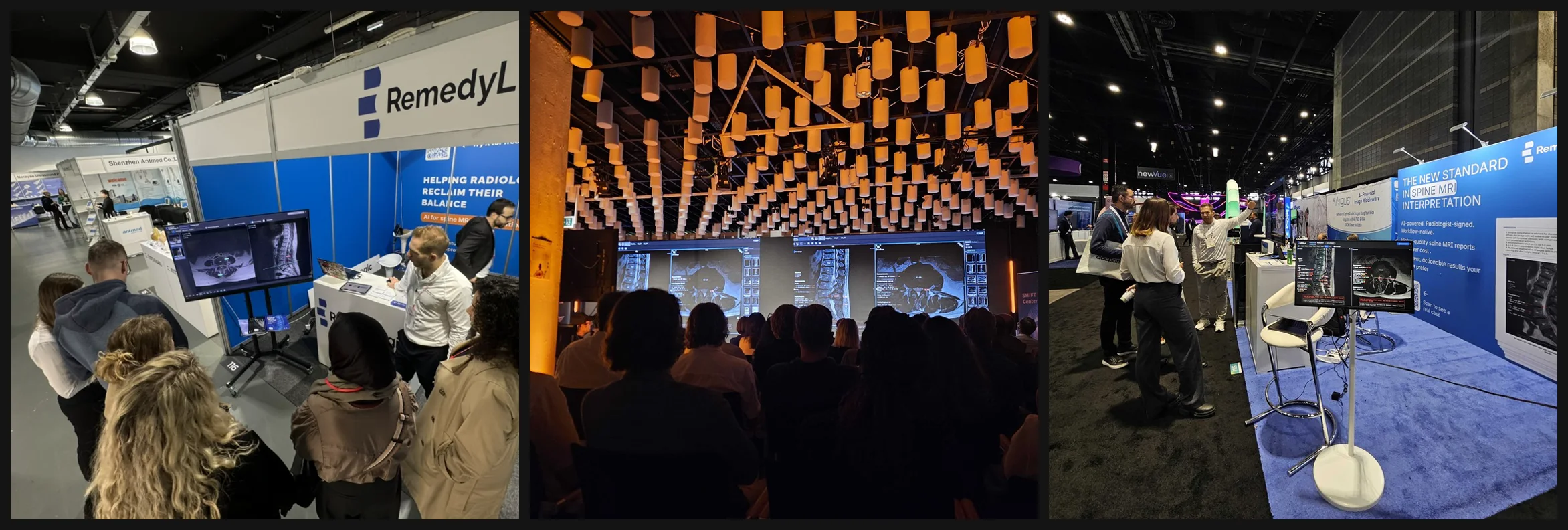 Three rooms where the picture was doing the work. Every screen carries a sagittal and an axial series with the findings drawn on them.
The library belongs to Remedy Logic and runs in their products and in their partners' viewers. The overlay marks the analyser's finding and prints its value. The radiologist reads the study and signs the report. The drawing exists so that disagreeing with it costs one glance instead of a second pass over the original series.
Footnotes
-
The developer sandbox once drew differently from the production renderer on identical data. It never reported its actual area, the library substituted a default, and the factor converting authored quantities into layout units came out different from the real run. A comment called the discrepancy intentional. That comment had been written about a default that was already wrong. ↩
-
How much tilt is too much differs between discs and vertebral bodies, and both are settled by thresholds in the configuration rather than by a branch in the code. ↩
-
The same problem one scale down. Each line of the findings panel carries a glyph, and centring it by its box puts it visibly low, because a curved mark drawn as an arc fills only the middle of its frame. The fix describes the honest bounds of the visible ink, under two obligations: a symmetric shape has symmetric bounds, and glyphs of the same visual height share bounds. ↩
-
The script that produced the fixture is committed beside it, so what it kept and what it dropped can be checked rather than taken on trust. ↩
-
A different configuration may simply fail to show a defect that is still in the code, and relative crowding depends on the height of the raster, so a defect has to be reproduced at the size it is judged at. ↩
-
The same silence came back later, when a half-applied module update left a helper undefined inside the failure-reporting path, and a render that had already failed then threw while trying to say so. ↩